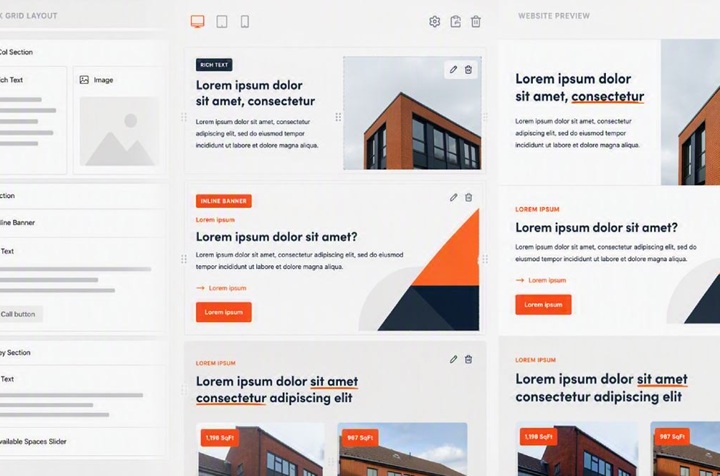
I remember when a popular Content Management System (CMS) by the name of Umbraco first released their Block Grid Editor. It gave me the tools to allow content editors (clients) to control layout and content all in one back-end experience.
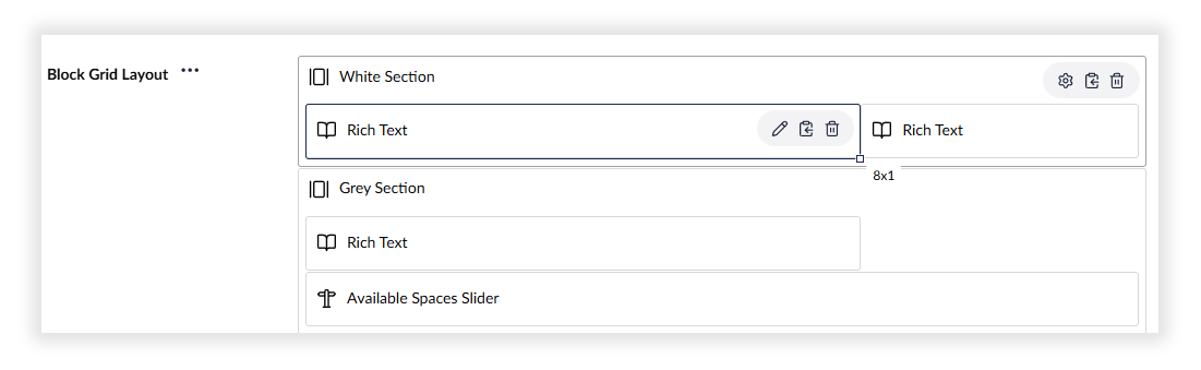
I was quite proud once I had it set up and working. The content editor could choose how many columns they wanted, drag to resize them, move them, and add content within them.
I demoed it to my team, and the feedback was positive, mostly. One person pointed out that it worked well, but looked pretty bad visually.
I hadn’t set up any block grid previews to reflect how the front end of the website actually looked!
A content editor would have found it very difficult to keep mental context of which piece of text for instance they were editing. They wouldn’t have been able to see how it fitted in alongside the other content on the page.
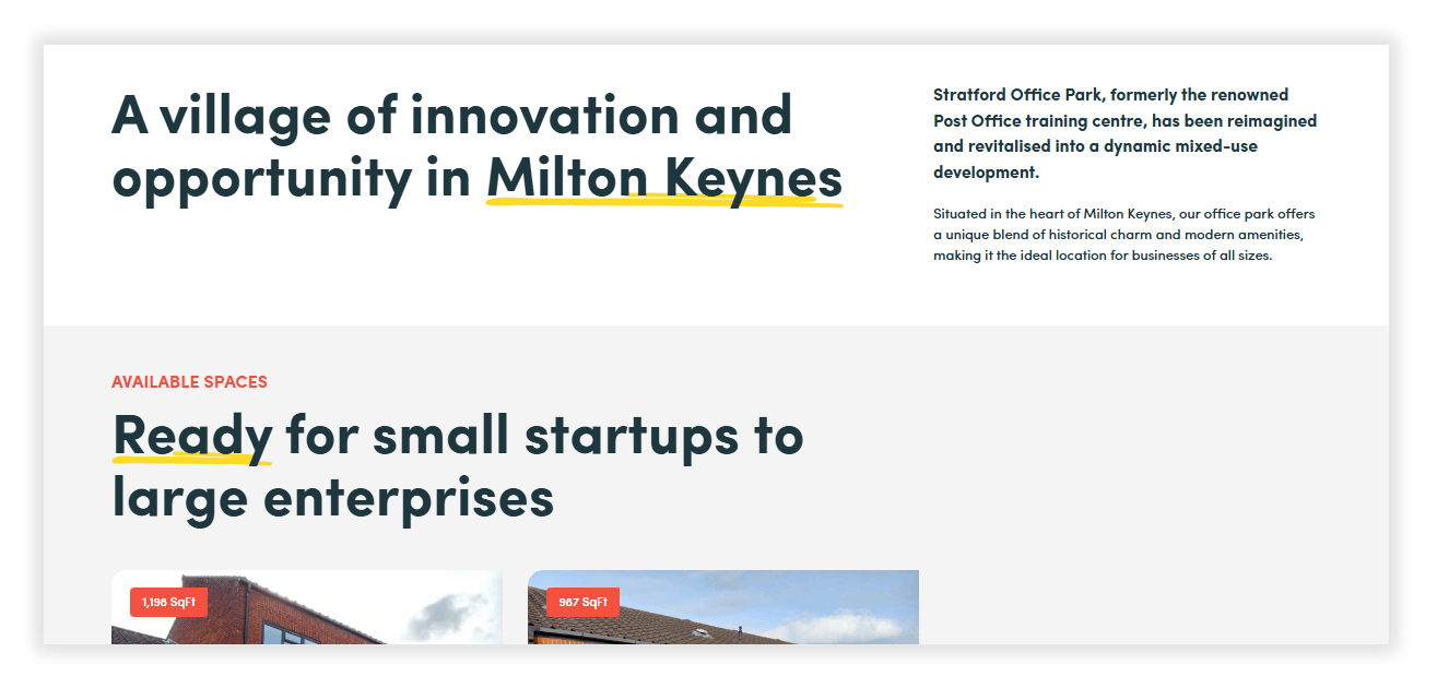
I thought the solution to this was to make the editor experience look as close to the front end of the website as possible. So I did it, for while, on a few projects.
Better made it worse
This time, there was no negative feedback from the team as it looked great, but something strange started to happen. Clients complained more. “Navigation not outputting as expected”, “Text alignment is incorrect”.
No bugs had actually been introduced. What changed was how the client was reading the interface.
It turns out that when a CMS experience looks like grey boxes and settings, the person editing the content mentally profiles it as a working area. Whilst when the CMS experience looks almost exactly like the front end, they consider it a guarantee of what they are going to get. This can’t realistically be expected, the very tools that allow the editing experience will affect the content in one way or another.
So, there is a line in the sand, it’s bad to make it look bad, and bad to make it look too good. I have settled on a CMS editing experience that looks kind of similar to the front end in terms of the correct layout and content, but not necessarily correct sizes, colours and dimensions.
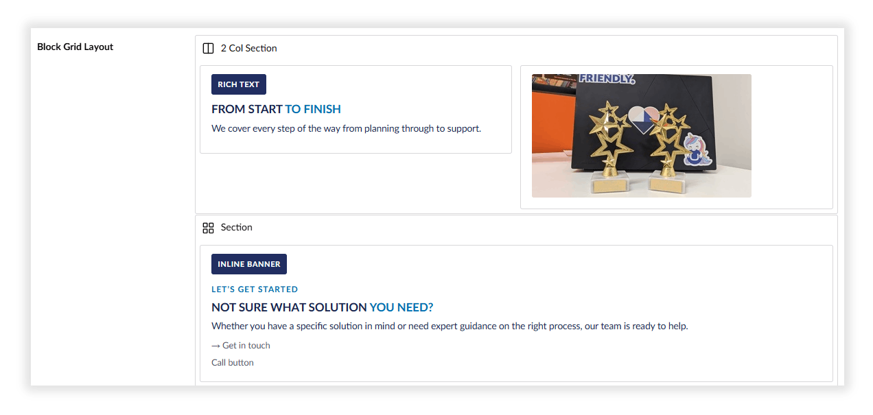
So far so good. The optimum experience needs to combine context on what and where you are editing, without the distractions of the front end of the website in all its glory. It’s something we now build into all CMS driven applications at Spinbox.