Stop Shipping Mobile‑First. Start Shipping User‑First.

The Pendulum Swung Too Far
For over a decade, “Mobile‑First” hasn’t just been a methodology; it’s been a commandment. When Google’s Eric Schmidt dropped the phrase in 2010, it was the wake‑up call the industry needed. We were living in a world of desktop sites shrunken down until they were illegible on an iPhone screen. We needed to force designers and developers to prioritise the constraints of the smallest screen.
It worked. It killed the bloat and ushered in the era of responsive design.
But somewhere along the way, a helpful framework turned into rigid dogma. The industry swung the pendulum so hard that we stopped asking who the user is and what they are doing. We started assuming every user is distracted, on the move, and viewing our work through a 6‑inch window.
The result? We aren’t just prioritising mobile anymore; we’re penalising the desktop. And in a world where complex work, deep research, and high‑value B2B decisions still happen on laptops and monitors, that’s a dangerous oversight.
The Trap: Designing for the Lowest Common Denominator
The fundamental issue with a strict Mobile‑First approach is that it forces you to prioritise constraints (small screens, slow connections, touch inputs) over possibilities. By treating mobile as the primary standard, we fall into several traps:
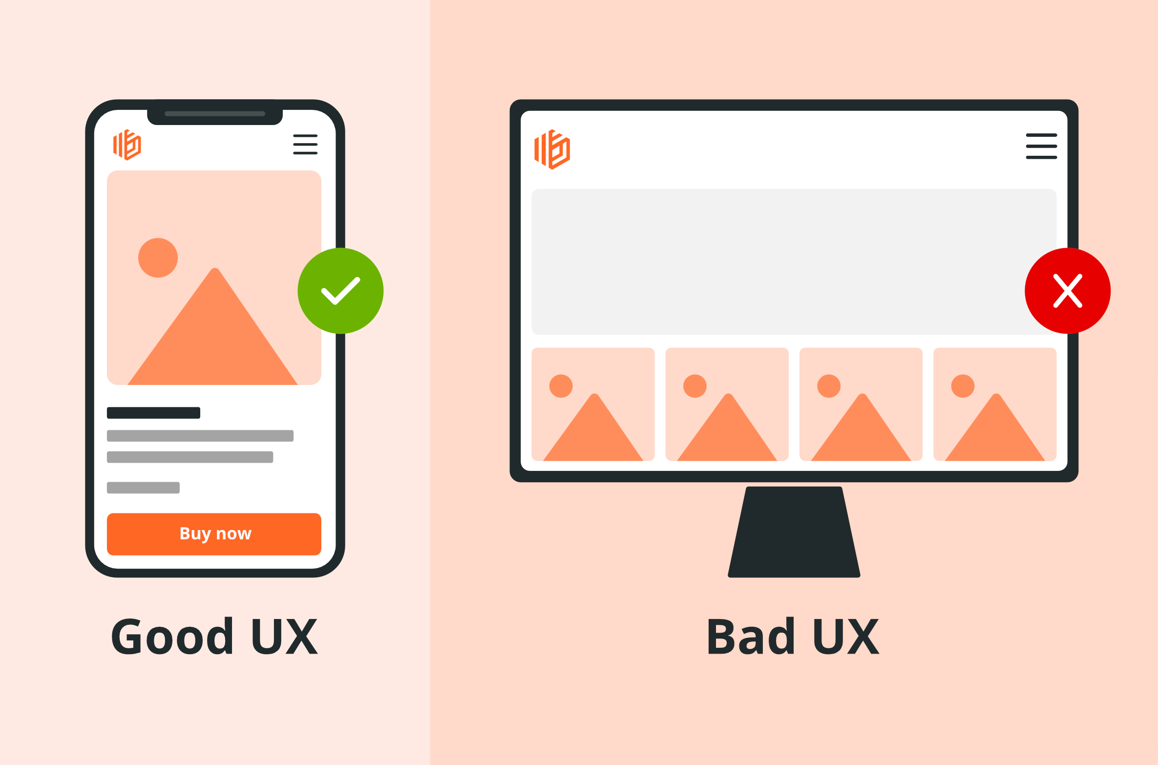
- Diluted experience: We simplify desktop interfaces to match mobile limitations, burying navigation behind hamburger menus even on 27‑inch monitors.
- Data scarcity: Essential information is hidden or stripped away, forcing power users to scroll endlessly for data that should be visible at a glance.
- Lost nuance: Rich interactions like hover states and cursor‑based creativity are discarded because they don’t translate to touch.
- Backward logic: It’s far easier to intelligently stack a rich desktop design down for mobile than it is to “inflate” a sparse mobile concept for the desktop.
We aren’t creating consistency; we’re creating consistent mediocrity.
The Reality Check
Ask yourself: when was the last time you conducted deep research, compared complex insurance policies, or booked a multi‑leg trip entirely on your phone? While mobile is fantastic for quick consumption, the features that make desktop powerful - rapid multitasking, side‑by‑side comparison, and the ability to keep twenty tabs open at once - are simply impossible to replicate on a handset.
This disconnect is most glaring in the B2B and SaaS sectors. If 90% of your users are office workers accessing your platform from a desk, adhering to a strict Mobile‑First dogma isn’t just inefficient; it’s actively hostile. It prioritises a hypothetical mobile user over the actual paying customer, forcing them to navigate through hidden menus and click three times to achieve what should take a single, precise action. By ignoring the user’s actual context, we aren’t simplifying their workflow; we’re obstructing it.
The Solution: Design for Context, Not Devices
The solution isn’t to swing back to “Desktop‑First,” but to embrace Context‑First. We need to prioritise user intent over device resolution.
If we’re designing a social app, mobile‑first is logical. But for a complex logistics panel or financial dashboard, we should unapologetically utilise the full screen real estate. This requires “progressive advancement” - building up from the core content rather than cramming it into a restrictive mobile grid. By letting the information dictate the layout, we design for the user’s actual environment, not just their screen size.
It’s Time to Retire the Narrative
Mobile‑First was the discipline we needed ten years ago, but it shouldn’t be the cage we live in today. Great design isn’t about adhering to a rigid methodology; it’s about solving problems for real people.
So, before you shrink your interface to fit a smartphone, look at your data. Understand your user. If the context demands depth, density, and power, don’t apologise for it. It’s time to stop designing for the device in the pocket and start designing for the human holding it.
Want an evidence‑based review of whether mobile‑first is helping or hurting your product? Speak to our UX team. We’ll audit your workflows, device mix, and information architecture, then prioritise the right experiences for the right contexts: https://www.spinbox.co.uk/services/ux-design